
The Elevate AI Consulting Rebrand: How We Built a Brand Identity for What Comes Next

TL;DRShort Answer
Elevate AI Consulting rebranded in 2026 with a full brand identity system—strategy, positioning, visual identity, color system (graphite #27292B, magenta #922C59, white), typography (Roboto), and applications from business cards to branded merchandise. The rebrand was driven by rapid growth (AI training bootcamps, custom software, AEO strategy, fractional Chief AI Officer work) and a speaking slot at eMerge Americas 2026 in Miami. Brand designer Diogo Carrilho (Lisbon) led strategy-first, then visual identity; the AI logomark (A+I as an upward arrow), magenta accent, and strict brand guidelines now reflect the firm as a serious, growing AI consultancy. The new identity launched ahead of the eMerge Americas workshop "From SEO to AEO: The New Rules of AI Search Visibility" (April 22, 2026).
I started Elevate AI Consulting with a clear mission: help organizations of all sizes adopt AI in a way that actually works. Practical. Measurable. Human-centered. But for a while, the brand itself did not reflect any of that.
The logo was something I put together early on, using whatever free AI tool I could find. The colors were whatever looked good enough at the time. The whole visual identity was, if I am being honest, a placeholder. And when you are sitting across from a Fortune 500 executive trying to sell a $15,000 training engagement, a placeholder brand sends the wrong signal.
So in early 2026, I made the call to invest in a proper rebrand. Not a logo swap. A full brand identity system: strategy, positioning, visual identity, typography, color system, brand guidelines, and all the applications that come with it. Business cards, merch, social media assets, the works.
This post is the story of that process, what we built, why we made the choices we did, and what it means for where Elevate AI Consulting is headed.
Why Rebrand Now?
Two things forced the timing.
First, the business was growing fast. In the past year, Elevate AI Consulting went from a solo consulting practice to a firm delivering AI training bootcamps, custom software development, AEO (Answer Engine Optimization) strategy, and fractional Chief AI Officer engagements. On top of that, I had just been hired to teach a full AI course at the University of Miami. My work had outgrown the brand.
Second, I was confirmed as a speaker at eMerge Americas 2026, one of the biggest tech conferences in the Southeast. My workshop, "From SEO to AEO: The New Rules of AI Search Visibility," was scheduled for April 22nd, 2026. That gave me a hard deadline. If the brand was going to show up at eMerge, it needed to show up right.
Finding the Right Designer
I connected with Diogo Carrilho, a brand designer based in Lisbon, Portugal. What stood out about Diogo was his approach. He was not interested in just making things look pretty. His process started with strategy and positioning before a single pixel was designed.
His proposal broke the work into clear phases: brand strategy and positioning first, then visual identity, and eventually website and communications. That structure mattered to me. I have seen too many businesses jump straight to a logo redesign without thinking about what the brand actually stands for. Diogo was not going to let me make that mistake.
Phase 1: Strategy and Positioning
Before we touched any design work, Diogo and I sat down and defined the foundations. Who are we talking to? What makes us different? How should we sound?
Target Audience
Elevate AI Consulting serves leaders and organizations that want to adopt AI strategically, not just experiment with it. Our clients are executives, operations leaders, and teams at companies ranging from SMBs to enterprise. They are not looking for hype. They are looking for someone who can help them turn AI into measurable ROI.
Brand Values
Human-Centered Innovation. We design AI solutions that amplify human capability, not replace it. Our implementations are built around your team's real workflows.
Precision and Clarity. We turn complexity into structured, measurable systems. Every solution is carefully designed and optimized with attention to detail.
Ethical Intelligence. We implement AI with full transparency on limitations, risks, and compliance requirements. We do not oversell outcomes.
Sustainable Growth. We focus on scalable, long-term transformation, not quick fixes.
Tone of Voice
Confident without being arrogant. Knowledgeable without being complicated. Approachable without being casual. Inspirational without being salesy. That balance is hard to get right, but it is exactly how I want every client interaction to feel, whether it is a workshop, a proposal, or a LinkedIn post.
Phase 2: The Visual Identity
The Logo and the AI Icon
The centerpiece of the new identity is the AI logomark. Diogo designed it using the letters A and I from "Artificial Intelligence," shaping them into a form that conveys both authority and upward momentum. It is an arrow. It points up. It says "elevate." The icon was refined to feel modern and bold while staying clean enough to work at any size, from a favicon to a conference banner.
The full logo lockup places the AI symbol alongside the logotype in a balanced layout. "Elevate" and "consulting" sit in graphite (or white on dark backgrounds), and the "AI" icon is always in magenta. That magenta accent is the signature of the brand. It is the first thing your eye goes to.
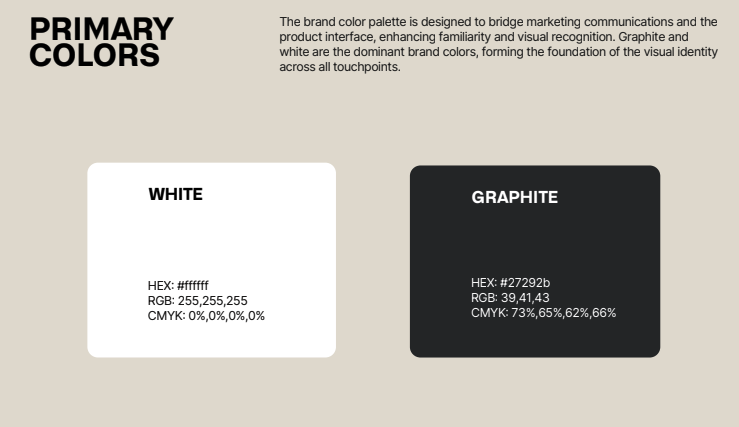
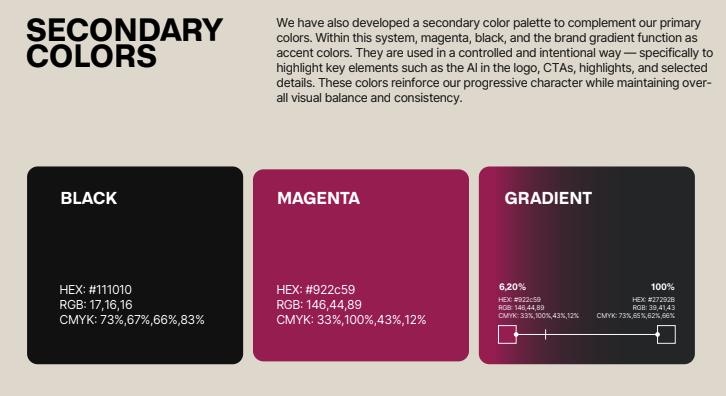
The Color System
Graphite (#27292B) is the foundation. It is the dominant brand color across all communications. Professional, grounded, and modern without being cold.
Magenta (#922C59) is the accent. It is used strategically and intentionally to highlight key elements: the AI in the logo, calls to action, and selected details. It is not a background color. It is a spotlight. Overusing it would dilute its impact, so the guidelines are strict about keeping it controlled.
White rounds out the primary palette. Graphite and white form the foundation of every touchpoint, with magenta creating energy and focus.
There is also a brand gradient (20% magenta to 80% graphite) that adds depth in specific applications.
Typography
Roboto is the typeface across the entire brand. It is modern, functional, and professional. It works at every text level from headlines to body copy, in print and on screen. As a Google Font, it is widely available and easy to implement consistently across teams and platforms. Roboto Black handles titles, Bold for subtitles, Regular for body text, and Thin for supporting notes.
Brand Applications: From Screen to Print
A brand identity only matters if it shows up consistently everywhere your audience sees you. So alongside the core identity system, we developed a set of brand applications.
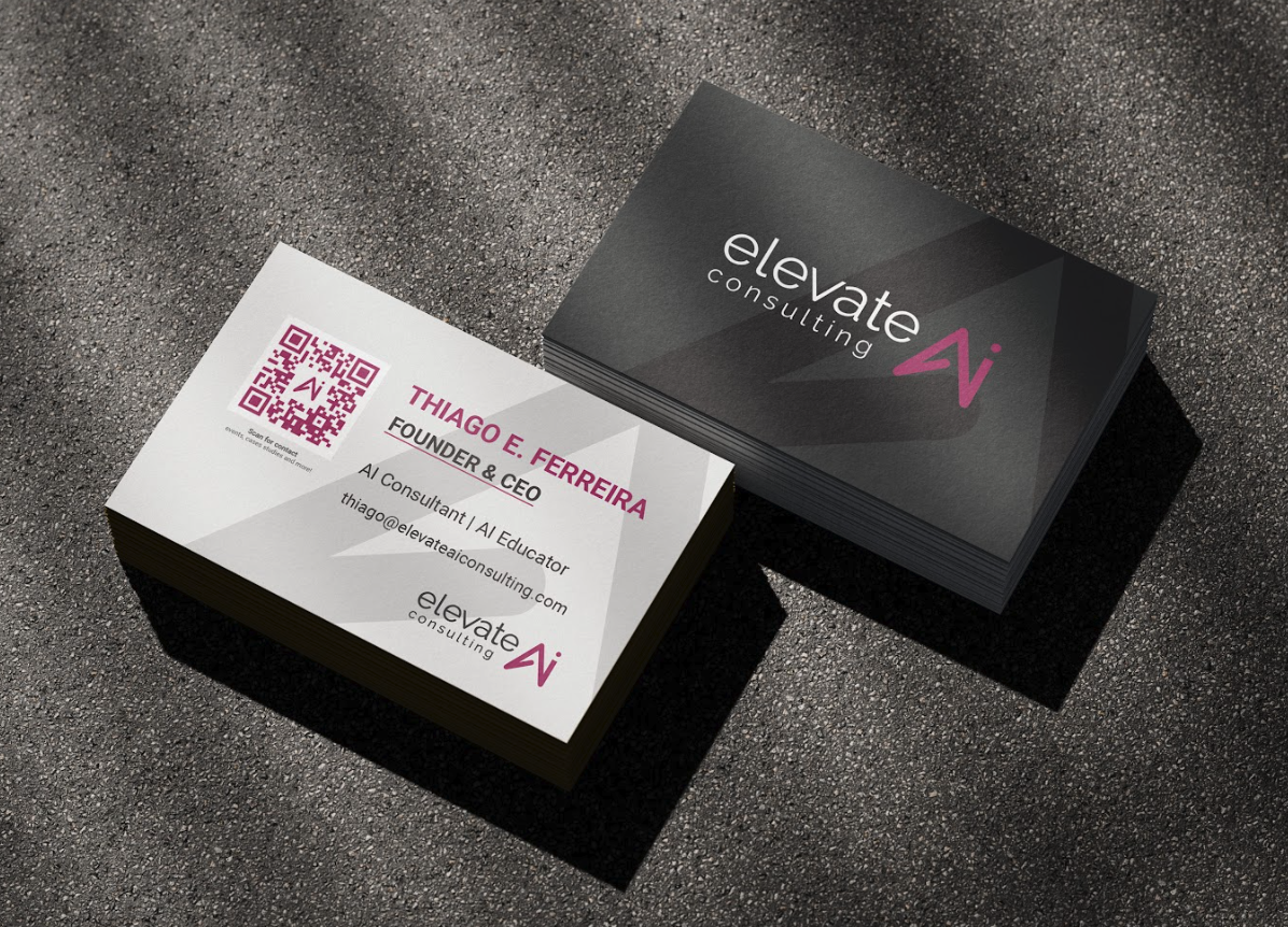
Business Cards
The business card was designed with the same philosophy as everything else: minimal information, maximum impact. The front side is clean white with the key details, a magenta QR code (with the AI icon embedded in the center), and the full logo. The back is graphite with the logo and a subtle oversized AI watermark pattern that adds depth without clutter.
No photo. No phone number on the card. Just my name, title, email, and a QR code that does the heavy lifting. When someone scans it, they get everything they need. The CTA underneath says "Scan for more info" because without a prompt, nobody scans a QR code.
Branded Merchandise
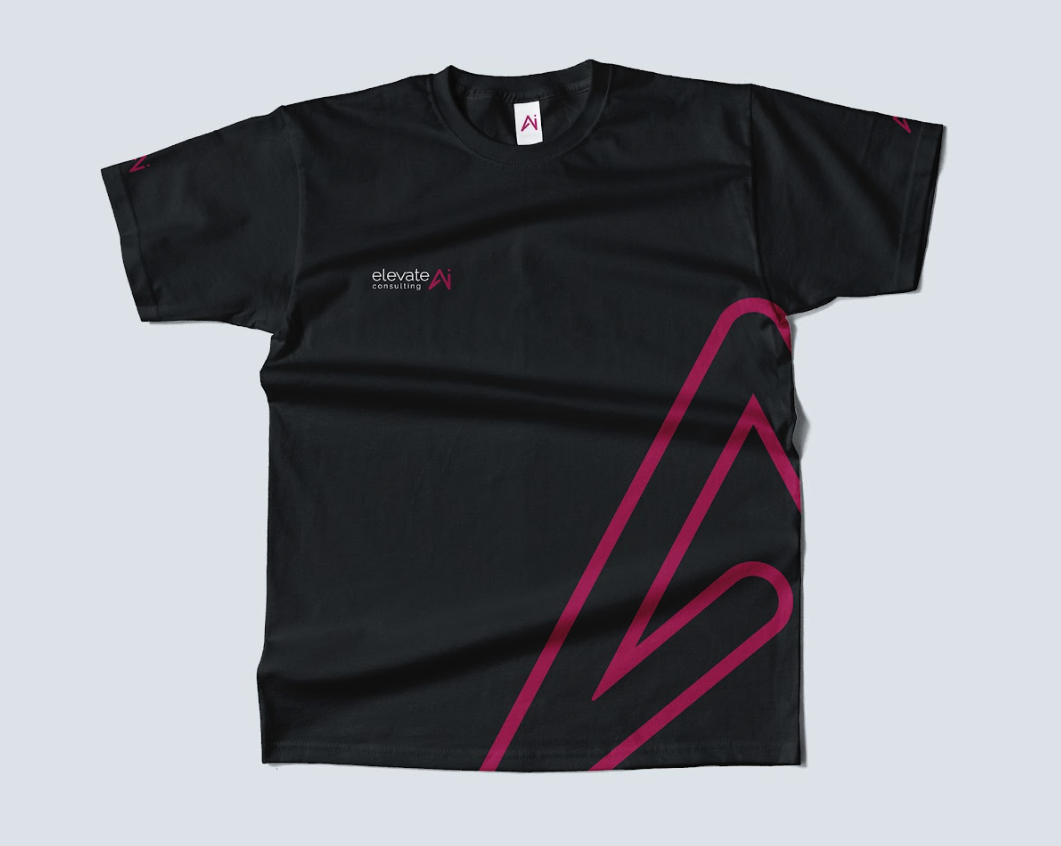
For the conference, I wanted a t-shirt that someone would actually want to wear, not a walking billboard. The design uses the oversized AI arrow in magenta running along the right side of a black shirt, with the full logo on the chest and the AI icon on both sleeves. It is branded without being corporate.
The final t-shirt design: magenta AI arrow, full logo on chest, AI icons on both sleeves.
The branded tag with the AI icon on the collar is a nice detail that Diogo added. Small touches like that are what separate a professional brand from a DIY one.
What This Rebrand Means for Elevate AI Consulting
This was not a cosmetic update. It was a statement about where the company is going.
Elevate AI Consulting started as a solo consulting practice. Today, we deliver executive AI training bootcamps, build custom AI-powered software platforms, run AEO strategy for organizations that want to be visible in the age of AI search, and serve as fractional Chief AI Officers for companies that need strategic AI leadership without the full-time hire.
The brand now reflects that reality. When a prospect visits our website, receives a proposal, or gets handed a business card at eMerge Americas, they are seeing a brand that looks like what it is: a serious, growing firm that knows what it is doing.
What Comes Next
The rebrand launched ahead of eMerge Americas 2026 in April, where I will be delivering a workshop on AEO strategy. The new identity is already live across our website, social media profiles, and all client-facing materials.
Next up: a full social media communication system with branded post and story templates, continued expansion of our service offerings, and more content like this to document the journey.
If you are a growing business thinking about investing in your brand identity, my advice is simple: do not wait until you "feel ready." The right time is when the gap between the quality of your work and the quality of your brand starts costing you credibility. For me, that moment was sitting in a meeting knowing my work could deliver, but wondering if my brand was telling the same story. Now it does.
To explore how we can help your organization with AI strategy, training, or advisory, see our services or contact us.
Credits
Brand design and identity by Diogo Carrilho, brand designer based in Lisbon, Portugal. Diogo led the full process from strategy and positioning through visual identity, brand guidelines, and all design applications.
LinkedIn: https://www.linkedin.com/in/diogo-nuno-carrilho-27984411b/
Instagram: @diogorcarrilho
Frequently Asked Questions
How does the Elevate AI Consulting color system work?
What does the Elevate AI Consulting logo represent?
What font does Elevate AI Consulting use?
What is Elevate AI Consulting's brand philosophy?
What services does Elevate AI Consulting offer beyond training?
Where does Elevate AI Consulting deliver AI training and consulting?
Who designed the Elevate AI Consulting brand identity?
Why did Elevate AI Consulting rebrand in 2026?